
Stephanie Coutas has always appreciated good design. “I have a wonderful mother, who always paid attention to all details; like having fresh flower bouquets or changing the decoration of the living room in spring and autumn,” she says. “She is the one who taught me to have a curious eye on things.” When Coutas decided to turn this passion into a career, she began designing interiors and in 2005 opened a design agency called Mille et Une Maisons (1,001 houses in French).
The French designer cites sources as diverse as Mother Nature, ancient silk motifs and 1940s cabinet designs as inspiration. “Inspiration is everywhere always,” says Coutas. “This is why creation is so rewarding.” When designing an interior, Coutas follows what she calls the “eye-catching effect”—when someone walks into a room, one thing has to catch the eye and the rest must be subtle and chic. “Our work strikes a good balance between the owner’s personality, sophistication and a touch of the daring,” she says.
Her most recent project was to redesign the interior of a Haussmannian pied-à-terre in Paris, commissioned by an American actress whose identity is as of yet hush-hush. The apartment was completely transformed by gently phasing out the Haussmannian side of the building (from the 19th century architectural movement that modernized remaining medieval neighbourhoods) without “destroying its soul,” says Coutas. “We also entirely redesigned the volumes and reworked the pathway and lighting.”
The apartment’s style combines the look of a luxury hotel with the “spirit of Paris,” which resulted in an elegant yet cozy home. The colour palette features subtle taupe and light mocha, and décor collaborators include Larsen, Rubelli and Lelièvre for curtains and fabrics, Tai Ping Carpets, Pouenat lighting, and Bisazza mosaic tiles whose iridescent gleam adorn the bathroom walls.
Here, the designer shares five decorating tips to help you achieve a similar elegant Parisian style.
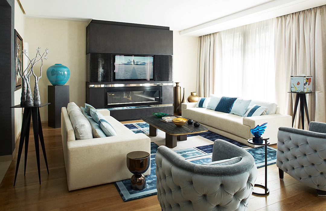
1. Set Bursts of Colour on Neutral Backgrounds
“The walls and consoles are very neutral in colour (I used a colour palette of taupe and light mocha) and simple in style, allowing me to introduce a pop of colour that stands out and doesn’t clash with lots of other colours or make the room look too busy. I’ve used blue and bronze, which work so beautifully together to dress the room and achieve my signature look of strength and femininity. The vibrant ice blue cushions adorn the neutral sofa, and the mixture of blues in the Tai Ping carpet (which I designed myself) pull the whole look together without overdoing it. You don’t have to stick to one shade of a colour; it gives the room more depth layering different shades of the same colour with each other.”
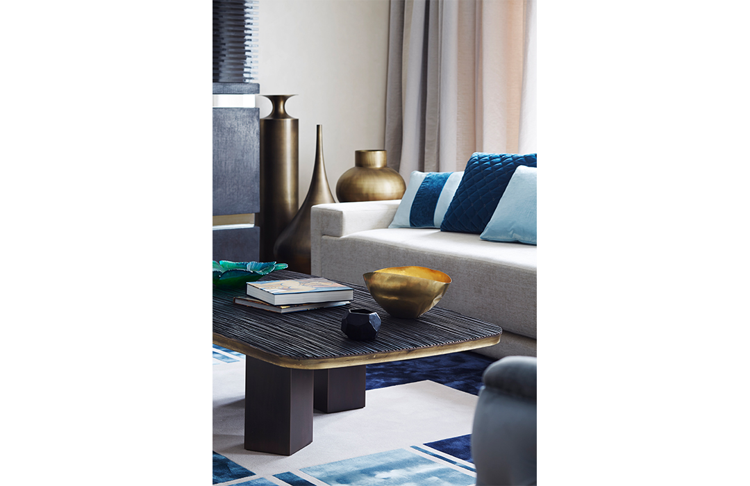 2. More Than Meets the Eye
“Touch is so important in design, especially in furniture that you will be using daily such as the sofas and chairs. The sofas are not only beautiful to look at but made with a plush velvet material they feel incredible to the touch as well, I continue layering textures with the cushions which are a mix of different fabrics. It’s not just soft furnishings though that should have texture! The living room has leather wall panels, which I think creates a sophisticated and refined element. I adore contrasting with my accessories, the bronze vases by Tom Dixon stand out not only in colour but also in their texture and metallic finish. Leather and velvet are my favourite textures to work with; I use them a lot in my designs.”
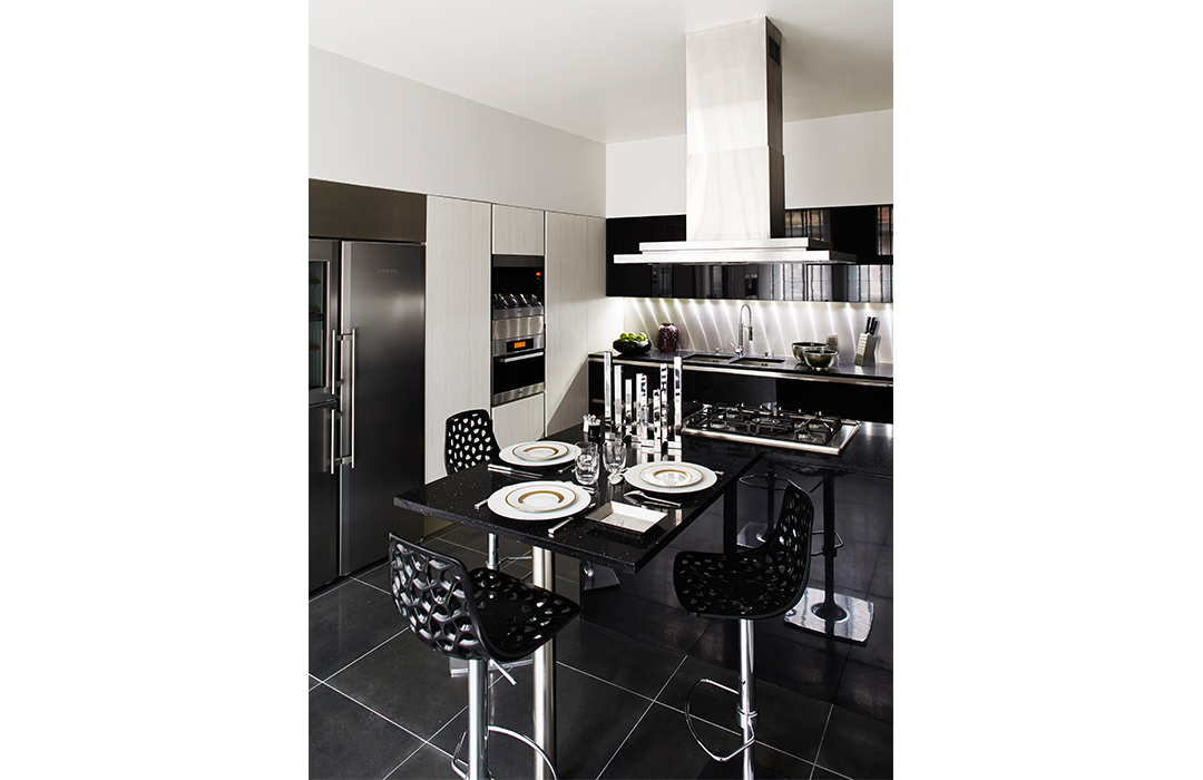 3. Opt for Bold Colours
“Black kitchens for me create a sleek and almost futuristic look, which is perfect for a room that is more about its functionality than any other. Essential kitchen appliances such as ovens, fridges, sinks etc. tend to come in rather stock colours of white, black and grey, so use that in the design! It’s essential to really think about the appliances that will be in kitchen and how they will fit into your design. I wanted to create a look that ties everything together with style and function. The black kitchen unit is in a black lacquered bamboo; I liked the contrast of the black lacquer with the metallic finish below it. The bar stools are very stunning too, and the cut out design adds some light so the table and stools aren’t just a solid block of black.”
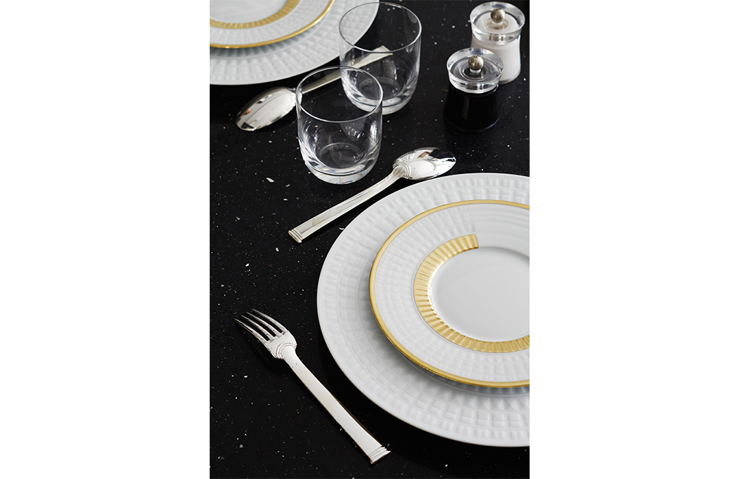 4. It’s All in the Details
“To contrast the mainly black kitchen, add an elegant monochrome look with contrasting white plates and cutlery. The chic Haviland plates invoke a luxury hotel look as the gold edging adds a really cool but glamorous and luxurious vibe. For me, glamour is in the details and the refinement. A good dining set is so important and can add so much to the finish of a kitchen or dining room. I’m obsessed with perfecting everything right down to the littlest details.”
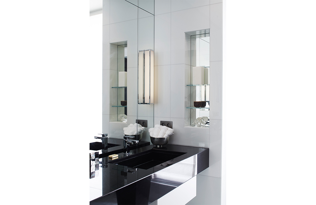 5. Don’t Fear Empty Spaces
“I favour a minimalist look in the bathroom, and similar to the kitchen, I continued a monochrome design. Bathrooms can often feel cluttered and I wanted to avoid that and keep a simple but chic look. I love the little alcove shelves cut into tiles and the mirror behind it increases the light and makes the room appear deeper and larger. One statement accessory on each shelf means the space doesn’t look crowded but it’s still eye catching, it’s the perfect place for a large candle of your favourite scent. As I said before, design should engage every sense and smell is just as important as the others.”